If you’re in the business of web design, you’ve probably discovered that fonts are the unsung heroes of our craft. They serve as the gateway between a website that looks stunning, and one that looks just… meh.
As a web designer myself, I’ve been in this position countless times: you just know you’re this close to a perfect website yet something’s missing. You know that the balance between the fonts you’ve chosen isn’t quite achieving your vision, but you’re too far along to spend precious time searching for the perfect fit.
Well, I did the doom scrolling and web searching so you don’t have to.
So, hold on tight as I share the selection of fonts I’ve found to be not just visually stunning but practically versatile for various design projects.
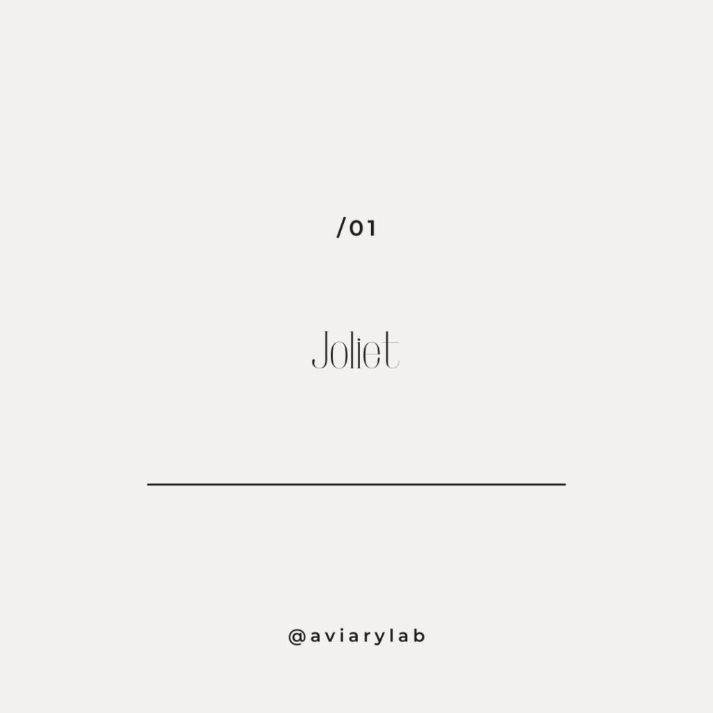
- Joliet:
Joliet is that rare breed of typeface that skillfully balances classic serif features with a contemporary twist. Use it for hero sections and headings where you want a welcoming feel.
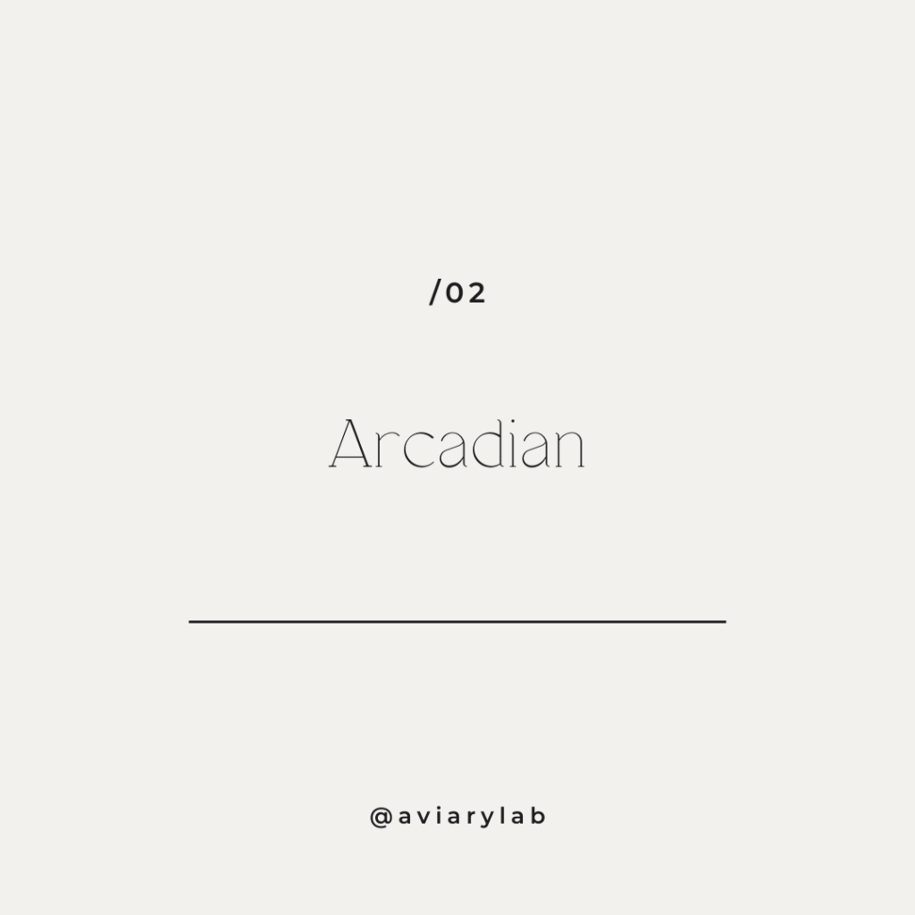
- Arcadian:
Designed for the screen, Arcadian is a sleek sans-serif typeface that encapsulates the millennial minimalist vibe with a dash of retro. This font achieves a unified, streamlined look across your website.
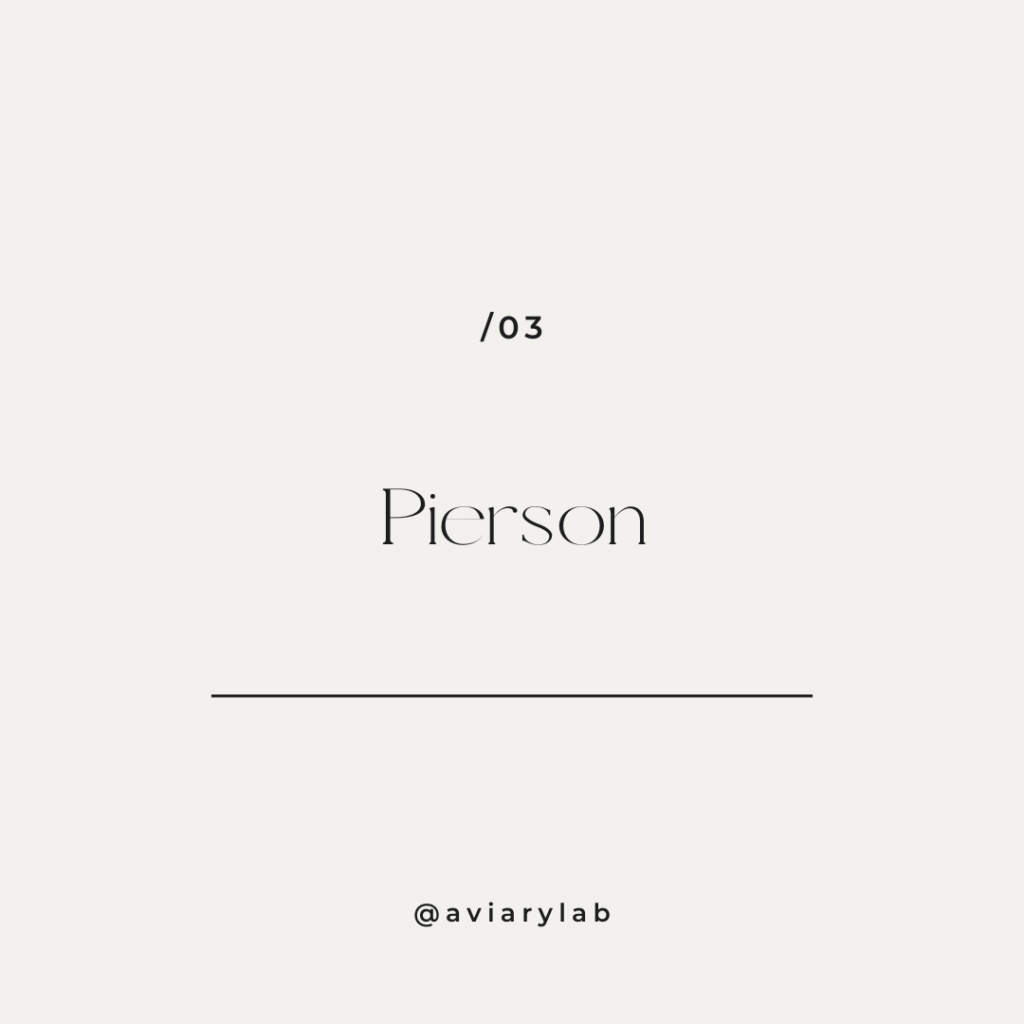
- Pierson:
For a bold, expressive touch, Pierson is your unapologetically strong yet refined sans-serif companion. Perfect for websites with a strong call to action or those that need to make a definitive statement.
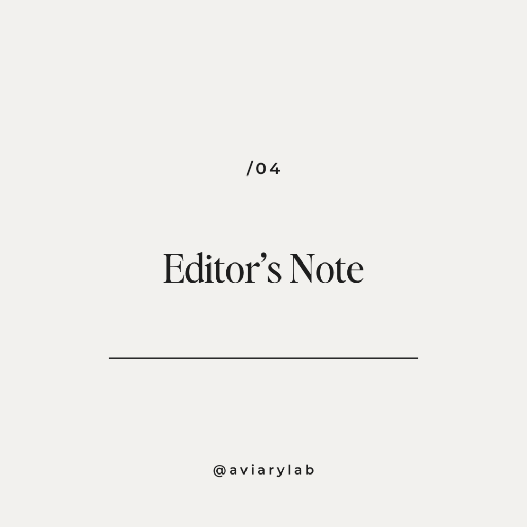
- Editor’s Note:
Editor’s Note excels at clarity and legibility without compromising style. It is an excellent choice for the meticulous designer who values whitespace and clean lines.
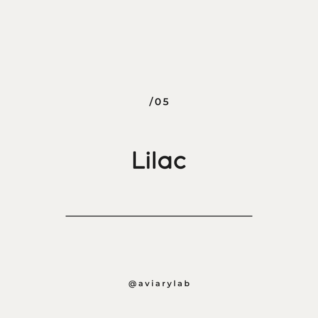
- Lilac:
Lilac is as fun as a font can get without losing its chic, designer-friendly edge. Use Lilac for special announcements, quotes, or anywhere you need to break the visual monotony with a delightful pop.
- Kinta:
For that timeless, elegant aesthetic, Kinta is a serif that refuses to bow to passing trends. This font is a fine choice for fashion, luxury, and heritage-focused brands.

Tips & Tricks
When selecting fonts for web design projects, the one-size-fits-all approach never truly fits. I suggest you experiment, pair, and try different combinations to find what resonates with your essence.
- Finding Your Font Footing
I’m big on supporting independent creators, but sometimes finding their unique fonts can be hard. A loop hole I’ve found is searching for fonts on websites like Creative Market and Etsy. Once you land on one you love, just go to the creator’s page and purchase it directly from them.
If you’re on a budget, FontJoy offers free tried and true font combinations that can’t go wrong.
- Font Pairing
When looking for the perfect font combo, keep these in mind:
Contrast is key: Combine bold fonts for headers with lighter fonts for body text.
Consistency counts: Use fonts with similar x-heights for a cohesive look.
Keep it simple: Stick to one primary font and one secondary font to maintain focus.
Complement, don’t compete: Your fonts should enhance your design, not distract from it.
Remember: Revamping your fonts can instantly breathe new life into your website, and experimentation is key to keeping your style fresh.
Save this post for future reference during your next design project!
Looking for more creative fuel? Follow me on Pinterest!
Comments +